|
I chose to look at James Rosenquist, due to his unique layering of images in his paintings that reflect some of my recent ideas with overlapping symbols with portraiture (combining my 3 squares). I mainly focused on his early work as that was most similar to what I am working on now. He worked in paint, sculptures, collage, drawing, screen printing, and more. His website is: http://www.jamesrosenquiststudio.com/ Information: Rosenquist is an American Artist, who became well-known during the Pop Art movement in the 1960s. His work that I focused on combined commercial art with popular imagery/everyday objects from print ads, photos, and periodicals.
Important Exhibitions (1960-1980):
Artwork
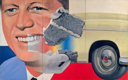
I think this piece is a good example of having overlaying of objects over a portrait. I like the piece, I would like to know more about the content within it. I think the contrast between the bright red and rainbow with the black and white cake is also interesting. In my work, I think I want to work on combining a portrait with objects or symbols that represent the subject so this is a good example of that. I was surprised by how big the piece is, I don't know if I might want to try working bigger, only if I switched to paint rather than colored pencil.
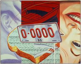
I really like this piece. It reminds me of the triptychs I've been doing, but more refined and with the few extra layers on top. I think the contrast between the colors is also really interesting from the white-blue on the left to the bright dark red and then the face. I'd like to work on doing this with one of my future projects, painting them on one canvas together. I could do it like President Elect with the overlapping images, or more of the background of this one with the straight line layout divided evenly. I think the composition fo this piece is also interesting with the toast and license plate seemingly laying on top of the three images in the background. I think that does give the piece some dynamism mirroring the diagonals in all aspects of the piece.
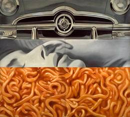
This piece reminds me of the background 3 images in Two 1959 People. I think it would be interesting to see a complete timeline of his work and whether or not he shifted linearly from clearly divided pieces to more overlapping without borders (like in President Elect). I think the scale of this piece is important to understand its impact. I'm not quite sure of the content, but the bright orange at the bottom definitely draws the viewer's attention. I also wonder why are the pieces not evenly split? Also, was there meaning in their order? With my past piece, part of my question for the group was what order of the pieces would look best. All of these pieces are definitely inspiring me to try painting, if not oil, and maybe at a larger scale with the portraits, but that might require relaxing on the realism, which would probably be a good experience.
0 Comments
Leave a Reply. |
AuthorWrite something about yourself. No need to be fancy, just an overview. Archives
June 2021
Categories |
 RSS Feed
