Abstract Expressionism:
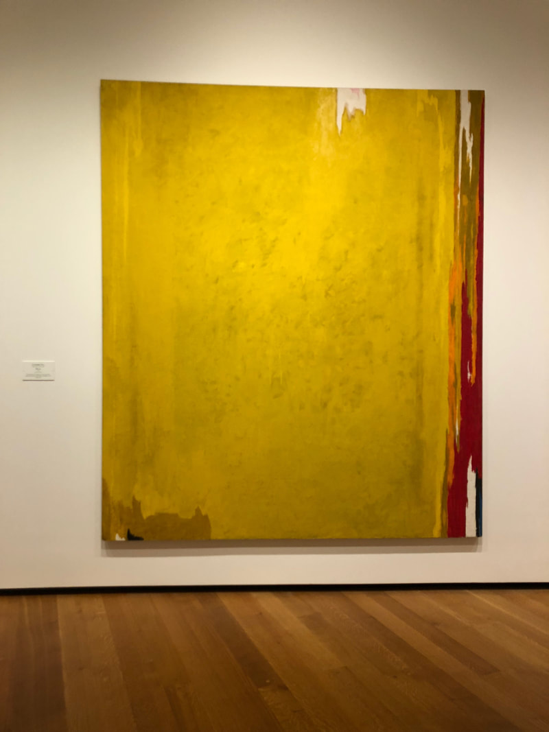
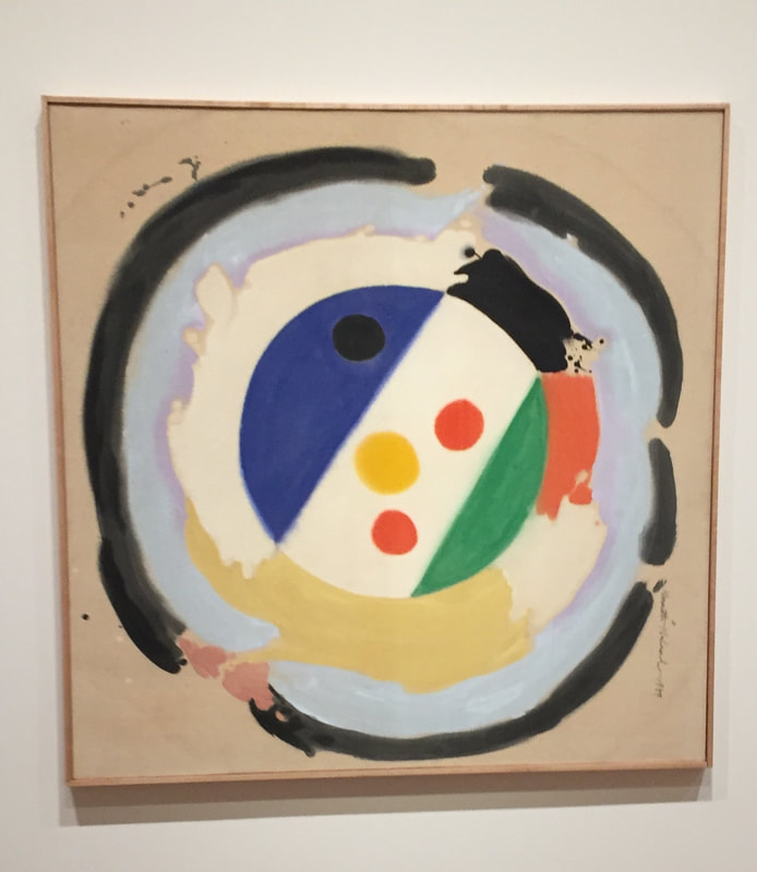
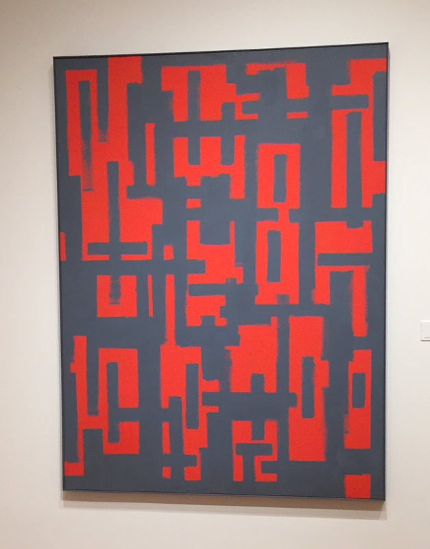
Overall, I thought it was really interesting to see the wide variety of works that are classified as Abstract Expressionist. Most of the work I saw either seemed like an action painting using gestural strokes, used contrasting colors, or some unusual material. Ad Reinhardt's Untitled (Red and Gray), shows how something as simple as a brush stroke fading away can add dimension into a piece. In addition, like many others the colors including the gray that seems blue toned, seem to create a contrast that draws the viewer in. The Clown painted by Kenneth Noland shows the contrast between shapes, the perfect circle in the middle and the expressive circular strokes surrounding it. Once again the colors add dimension to the piece. In addition, PH-115 seems to reveal more about itself as you look closer. The seemingly one toned background yellow is is broken up by many slightly different shades of yellow and the more obvious multicolored right edge that he may have created by dripping paint. I was surprised to see that all three pieces I chose were simply oil on canvas, but it definitely will serve as inspiration for my piece. I want to further research how Still made his pieces as the slight color differences may not have been purposeful. I always have enjoyed the almost geometric patterns that can be created overlaying straight lines like in Reinhardt's piece and I want to explore that too for my piece. Play Page Inspiration:
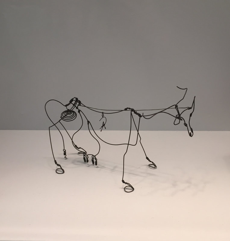
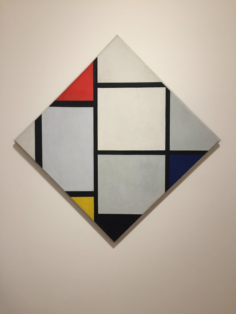
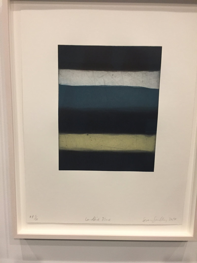
I found there were a lot of interesting exhibits and artwork that inspired me in DC. I did not choose this as one of my three pieces, but I loved the Pulse exhibit, the water and the light section were my favorite. I definitely want to explore interactive pieces like that in the future. As you can see, all of the pieces I chose have to do with line, which was unplanned but points out a theme I should try to focus on. As I mentioned above, I often doodle drawing lines and geometric shapes and I want to see how I can use this in my art. One piece that immediately caught my eye was Piet Mondrian's Tableau No. IV. He turned a canvas 45 degrees but somehow that completely changed how I saw the piece and made me more interested. I also thought it was interesting how he played with the balance of line quality and color to make emphasis on certain parts of the piece. A lot of Sean Scully's work interested me, but this one, Landline Blue, in particular probably due to the colors used and the subtle blending and translucency. I did not notice this at the time but I have never heard of the materials he used which I would like to further research. In addition to its appearance that I find to be calming, the content about how it represents where the land meets the sea and how the horizon can be divided is really interesting. I also love how the dark blue repeats creating the sense of a pattern. Finally, I chose Alexander Calder's Cow, a wire sculpture. I was drawn to the sculpture because of how 3D it was and how the form seems simple but has many small details. I want to explore wire sculptures or maybe drawing as if I were drawing a sculpture because I am interested in how the lines work to make two dimensions seem like three. My official theme for the play pages is fruit and although I have veered off from that I could see making a series of wire sculptures of fruit. Overall, I can say that I had a great time on the trip and enjoyed getting to spend more time in the East wing of the National Gallery as I had not gotten to last year and even finding the montage of Calder's works in the tower.
1 Comment
Final Comparison:
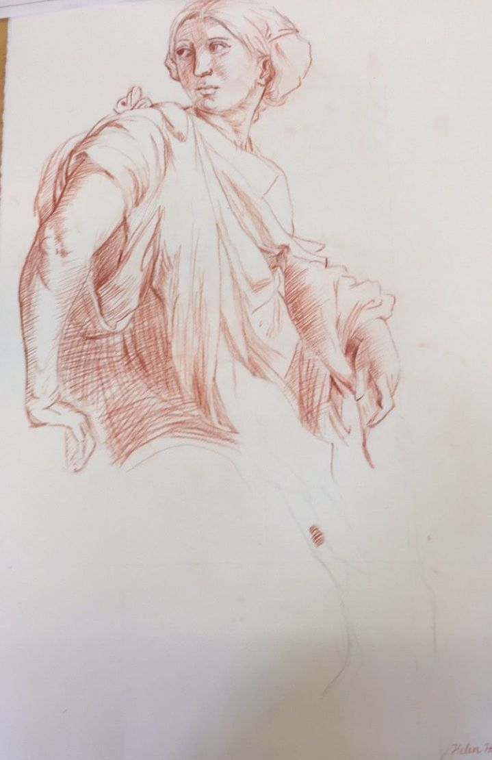
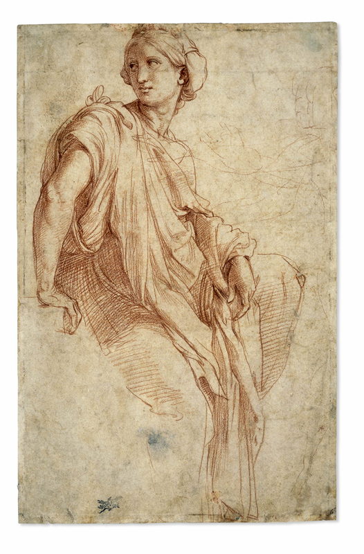
Today I finally finished the project and put my finishing touches. I started with the neck and the hair after finishing the shirt. Next I started on the face, with the nose, mouth, and eyes. I was really happy with the nose and the right eye, I think my left eye looks weird but it seems accurate to the photograph. I struggled with enough contrast between the face and the neck, as well as the direction and curve of the lines. In Raphael's drawing he used a mix of straight and contour lines so I tried to do the same. I went back into the face and attempted to add more overlapping lines to create a darker value where my face is in shadow. For the mouth, I decided to not draw the lines of the teeth as past experiences had led me to believe it can lead to an odd overall look. Underneath the slideshow of progress today I have my final work, my Raphael recreation, and the original Raphael drawing. Overall, I am so happy with how this drawing turned out. Unlike my recreation of Raphael's that had a lot of proportional errors, this seems to be accurate. I know the values and contrast may be not perfect but without comparing to the reference photo I don't think it would be that noticeable. I felt like I used Raphael's mark pretty well, I tried to use lines and line quality to create value and avoid blending out the lines the best I could. I really enjoyed this process as I had always struggled with cross-hatching and this definitely helped a lot and I am much more confident with conté as well. Today I finally got started on the mark making focussing on the hands and shirt and started on the hair. I am overall pretty happy, I struggled with figuring out how to layer the conte in order to make the most accurate values and making parallel marks. When I started I really struggled with the hands but I think the overall effect works. I might want to go back and darken some areas as I continue the drawing. The hair was a bit of a challenge as the photo seems to show the hair as dark but I wasn't sure how to show that value. The direction of the mark was also difficult as I didn't want to draw each strand but I wanted to get the overall values. I am definitely planning on saving the face for last as it will probably be the most challenging part and I'm not sure how to begin. 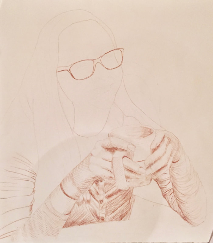 |
AuthorWrite something about yourself. No need to be fancy, just an overview. Archives
June 2021
Categories |
 RSS Feed
