|
Last week, I finished my first portrait, so this week I focused on working through my second drawing. I was having some difficulty getting the proportions right. I used a grid like before, but the mouth was specifically difficult and it felt like things were not in the right place. The original outlines looked okay, but the value did not seem to help round out the face. I've gone back to redraw the mouth a few times, but can't seem to get it right. I think next class I'll add some finishing touches and then move on to the third.
0 Comments
(image will be added)
Sadly we will not be able to finish the oil painting, which was sort of expected, but overall Ihave really enjoyed the process. I can definitely see myself painting in the future. For this project, we used the indirect method, first painting brunaille, grisaille, and then color glazes. I only got to grisaille, but I definitely understand the method better than before. I decided to paint a clock and a lemon. A little way into it, I regretted choosing the clock due to its reflections, but good to know for next time. The first few classes, we painted the brown underpainting, brunaille, and I liked doing the grisaille and really trying to pinpoint the highlights and shadows. Overall, even in this short time, I have learned a lot about the materials and process of oil painting, and will continue to explore it in the future. 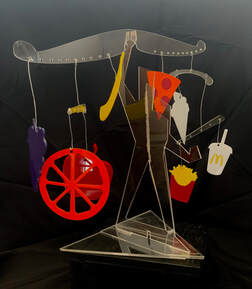 The sculpture is finally done! Above is one photo, the other angles are in my gallery. Overall, I am pretty happy with the result. Putting it together was definitely one of the most difficult parts of the process. I definitely don't love working with wire, and attempting to balance all the pieces proved to be challenge. In addition, when the bar was finally together, the man wasn't steady enough to hold it up without bending, Because of this, I attached a leftover half from a previously broken part of one of the human figures. It worked in the way that the structure was stable (enough) and that was good but aesthetically, I do not like the hot glue gun in the middle. Especially considering the rest of it was done so it would be sleek and not have anything like that. Despite this, it actually turned out quite close to what I had imagined in the beginning, and I think it was an amazing process as I learned how to use the laser cutter through trial and error and that will definitely be a tool I use in the future.
Since my last update, I haven't gotten to work on my sculpture too much but I have made some improvements/additions since then. I have now printed out all of the pieces of fruit/fast food, and just need to glue the separate pieces together if necessary. One of the main things I have dont is print out the bar/hangers that will be used to hold these pieces and I designed multiple different sizes/styles to balance the sculpture. By the end of the month, I need to put everything together and just make sure everything works. I am pleased with how my sculpture is coming along and I can't wait to see it all together.
This week, I made some good progress again on the project, although sadly I haven't completely finished and I missed Wednesday as I was sick. So on Monday, I printed all of my remaining pieces except for the final bar structures where the food will hang from. I did design the main structure to look like a human, that will be holding up the balance which I think adds to the content. I drew inspiration from the Incredibles end credit geometric style of drawing a figure. In order to make it stand up, I placed slits at the bottom so cross pieces can be added to make it more stable. Overall, I am pretty happy with this, the hard part is going to be putting it all together. Below I put a photo of the structure and behind it you can see the Glowforge laser printer I've been using throughout the process. 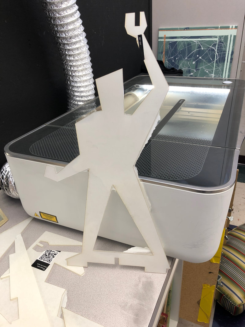 This week I continued to work on developing my fruit and fast food shapes via Adobe Illustrator. It definitely has a learning curve so I'm trying to figure out the different processes. I also worked in my sketchbook to figure out what to do for fast food shapes. I'm currently planning on doing french fries, pizza, a soda cup, ice cream, and a hamburger, but I think I might need one more. I also need to decide on plexiglass colors as I'm not sure if I could do multiple colors for one food shape. Hopefully in the next week I can get my shapes done and start planning the base and how/when I'm going to lasercut. 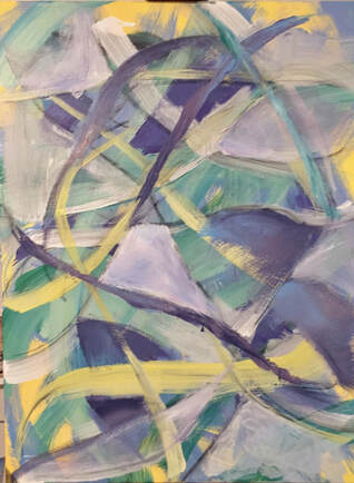 So I took one more day to attempt to "finish" the piece. It was definitely difficult to decide what would make it finished. I focused on creating blended colors which you can see in the purple blue sections, as well as added more white sort of blocked out areas to balance out the white in the middle. Using a palette knife and brush I did .a few additional strokes of paint in purple. Finally, I also added another layer with more colors to dilute the bright white in the middle. I definitely think it has more of a finished quality. I wouldn't say its my favorite painting, but I'm overall ok with how it turned out although it was very different than what I expected. I definitely decided that I prefer working with brushes and not using drip or staining processes. I tried to get some texture but it was relatively minimal and more about the gestural strokes. I think if I were to redo a layer or change it, it would have to be the yellow marks. I think the color is just very basic and flat and has a lot less dimension than the rest of the piece. In the same line of thinking, at the end I really started to blend colors and use that to color in shapes, but I think I should have been doing that the entire time. This being my first painting on a somewhat substantially sized canvas, I'm happy with it. I definitely learned a lot through this process, and got to try a lot through experimentation. I think I would be interested in doing another one given what I've learned and if I put less pressure on myself knowing I've already completed a full one, especially experimenting with another color palette. I also have been influenced and inspired by the works of my classmates and want to see how a bit more texture would change my work. I don't think I'm a fan of huge texture, but a bit more subtle changes on the surface could add to the expression factor. Below this I will create a slideshow to show the complete evolution of my painting.
The first step I took on this day was adding another charcoal layer. I had liked it and how the paints had layered over it in the past layers so I decided to add more. I had a little more difficulty getting flowy marks that were solid lines with line quality, which is why theres a couple lines with multiple marks. I think there also was a bit more hesitancy and rush as this was the last class day to work on it and I was not sure how to make it a finished work. I knew I wanted to use white next but I wanted to do something other than more gestural strokes because my goal wasn't an all-over composition I wanted something to draw the eye and create something more specific than that. My teacher suggested again filling in shapes, but that became increasingly difficult for me. Because of how I had covered my favorite aspects of the painting in the past, I was really scared to block off areas like he was suggesting, as I didn't want to cover up all of the layers I had created even though that is sort of the point. Through the frustration, I added some white marks and filled in a shape in the center that I do think creates a good focal point. Later that day, I went back to add additional marks in a similar yellow to what I had started with. I don't completely dislike these marks but I tried to do multiple yellow tones and that is not completely visible which I think would have created more depth in the stroke. In addition I don't think the same amount of line quality is present that there was in the first few layers. I am not sure if this is the finished painting yet. I am content with it but I think it is missing a last piece that would truly make it "finished". 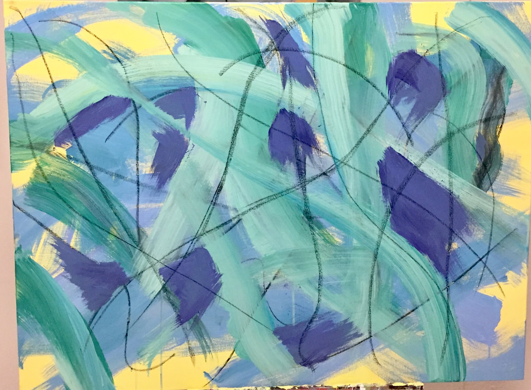 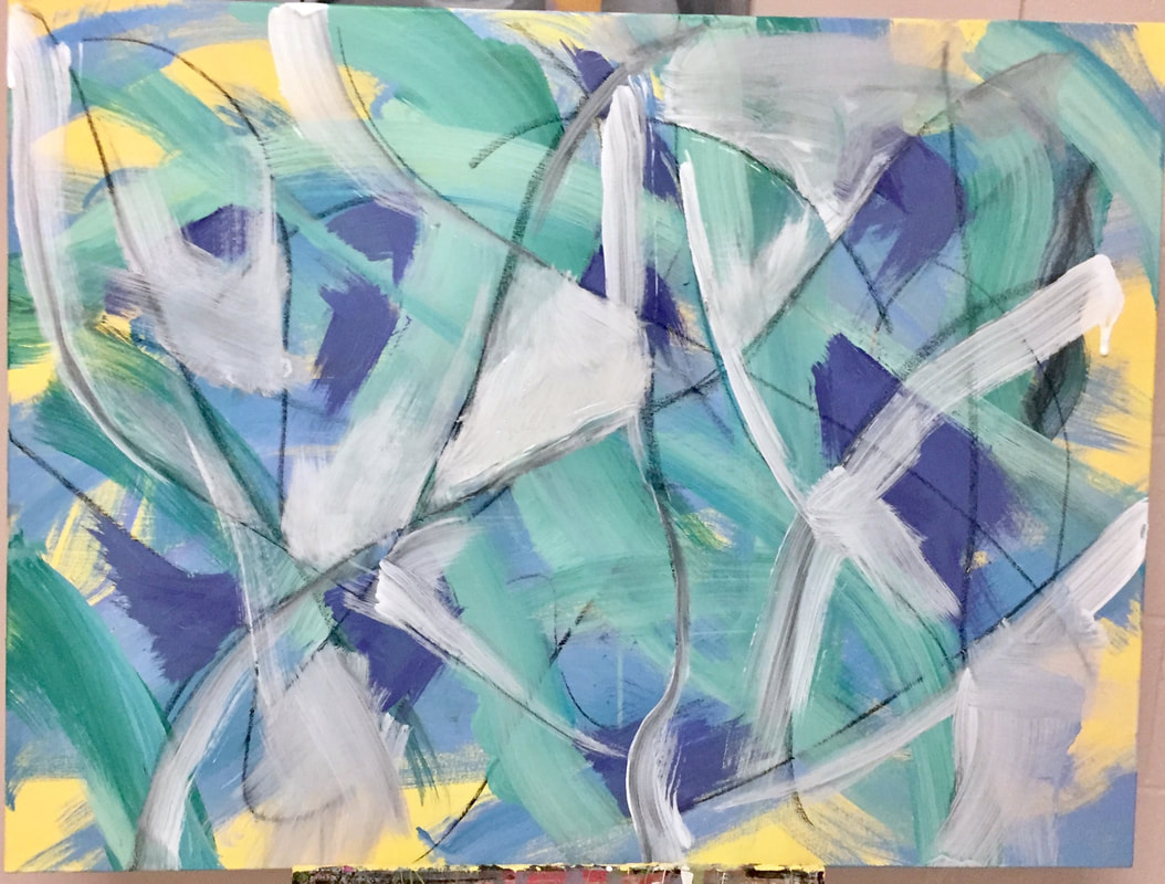 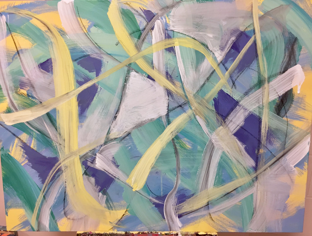 Feb. 11:So this day I made a lot of progress on my painting. I started by making large gestural strokes over most of the painting with two blue colors blended which created a really nice layer. This honestly may be my favorite part of the painting, I really like the effect that these two blues created. This also started the gestural flow that my painting follows after for the rest of the time. Next, I cautiously applied charcoal to the painting after experimenting with different types. I did not like this at first especially considering I had not followed the "don't get attached" advice. As soon as I added the next green layer though I started to see how the charcoal adds depth and deepens the layering effect. I hadn't expected the paint to mix with the charcoal but it actually created really cool effects. The green paint also is multi-toned like the past few steps. I definitely began to get frustrated especially when I covered over some of my favorite blue sections. 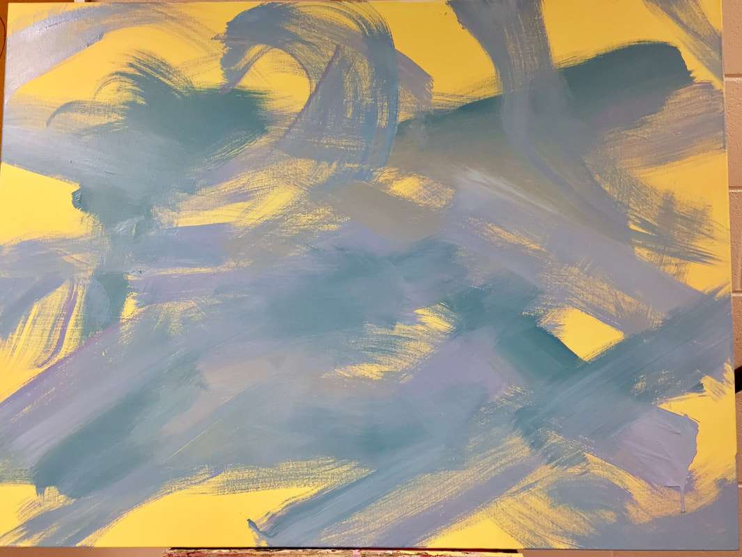 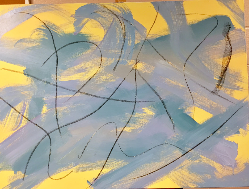 Feb. 13So this is where it started to get complicated. I was attempting to follow the advice to "fill in shapes." Being a normally precise person I kept attempting to fill in specific shapes with this purple paint and then trying to blend it unsuccessfully to get a gradient, and it was not working. I definitely was not a fan of this step especially when doing it because it felt like I was restricting myself and I wasn't sure where the "shapes" were to fill in or overlap. After a while I did try to fan out and have more expressive edges even to the defined shapes. My main issue with this section was that I think I covered up some of my favorite parts where you could see through to the other layers and I was unhappy that they were now lost under the purple paint. The green blob in the middle was also throwing off the balance to me and that bothered me. 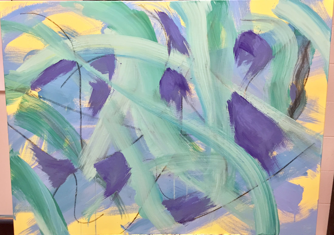 On February 6th, I started my painting. I definitely did not have a perfect plan going into this project. Through consulting with my teachers, I had an idea of the steps I would take, starting with layering thin layers of paint. This first day there was not too much time to start so I began by painting a full complete layer of two tones of yellow paint, achieved by adding some fluid pigment and blending the two together with a flat paintbrush. As it was just the first step, I couldn't rly judge it yet, I did like the effect of the two blended colors and I think it was a good basis for the rest of the painting.  |
AuthorWrite something about yourself. No need to be fancy, just an overview. Archives
June 2021
Categories |
 RSS Feed
