|
Although i was not able to attend this lecture in person, I really enjoyed getting to see what the students said through the facebook video. I am not planning on art school, but it still was interesting to hear their different responses. One student mentioned how he actually did a lot of research on other subjects to inform his art at VCU, which I hadn't really thought about before. I probably related most to the student at UVA Architecture because he hadn't planned on art school, but rather gave up on politics and decided to apply. He liked architecture as a creative outlook with guidelines, something I would like. Hearing about the AFO (art foundation) experiences were interesting, I didn't know they were really a thing. It seemed like after the foundation classes and electives with specific assignments, your art could be pretty self-directed, which is good if you are pretty sure about your idea and content, but as I am less content driven I think that could be difficult. I was really surprised by what Lily Mae? said about the bias against graphic design and illustration, and a lot of the panelists expressed that they found a lot of people who complained a lot about the workload which isn't surprising. I did think it was cool how Alexis said she was able to study abroad and weaved in what she learned into her work. It definitely seems like a lot of art making with possible 8-hr classes, which would be good to develop more work, but not really what I'm aiming for. Having the architecture person was interesting as it showed possible options for creative outlets without going to an art college. Overall, I found the talk to be intriguing and I enjoyed hearing more about the experiences at an art college, even if I decide to not apply to art colleges specifically.
0 Comments
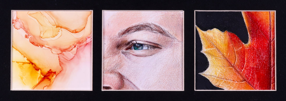 It's done! I am overall really happy with this piece. I really enjoyed experimenting with the alcohol ink and working with colored pencil, which I hadn't done in a while. I still might switch the pieces around but we'll see. I did like working with the details in the leaf and sort of in the face section. I do kind of wish it was a bit smoother, maybe for next project. I think it does express my content and definitely met my goals from last critique. We did talk about maybe making this a series with the next one being cool colors vs these warm colors. I don't think I'd want to do more than one or two more of these though, even though it was fun.
This weekend, I finished up my piece. I put some finishing touches on the colored pencil drawings, and then focused mainly on the abstract portion. I did watch the video about how to use the alcohol ink during my curiosity page research, and it definitely is harder than the video makes it out to be. I luckily did find another hairdryer that wasn't so strong so I could actually move the ink around before it dried. I had a bit of issue with where the ink would wet a part of the page and if the hairdryer pushed it past there it made unorganic weird shapes that just looked weird. I also really wanted to try using this gold add-in but I found it to be really difficult to get to work the way I wanted it to. I'm glad I did try it again because I think it did produce a cool effect, and I think it works well in the triptych. When I was choosing which section to use, I thought it sort of mirrored how the veins in the leaf were angled, so I went with that section. The other struggle I had was the orientation of the pieces. I went with abstract to the eye to the leaf because I thought it balance the colors. However, in critiques people said it would be better where they were in the first image on the slideshow so it went from the black matte to the black in the leaf to the abstract with the eye looking towards the two.
This week, I made really good progress. I started and finished the second square, the object I thought represented Matthew. So I found this photo of a leaf, sketched it, and started. I am not super happy with how the paper texture is showing through the image of Matthew, so I really focused on layering the colors at first, but then really adding dense saturate layers. I think this really helped make the colors vibrant and the contrast with the black makes them pop. I also tried using the exacto knife to carve in the details, which I found to be pretty effective. I overall am really happy with the outcome of this piece, I think it is bright and seems pretty realistic.
This week, worked on the overall skin tone. I feel like it looks too gray, but I'm not quite sure how to fix it without everything looking too warm. I also don't love the texture showing through, but I'm hesitant to go too dense on the colors and have them be too vibrant or too overdo the white and have everything be too muted. I also realized that the eyebrow looked weird so I re-alighted the square with the grid and it is definitely not following the same grid. I think I might have mis-measured at first? I don't think it looks too bad, so I'm going to stick with it and try to adjust some things to make the proportions look right. I also did my first experimentation with alcohol ink on the yupo paper. I had a really hard time with the hairdryer I was using because the colors kept drying before I could even move them around. I also hadn't planned ahead and I didn't have the extra rubbing alcohol you use to blend the colors together. Around the edges where the color was pretty light is what I'm aiming for, but I think I'm going to try again with the extra blending alcohol and see if it goes better. I also am going to watch a video I found about it and see how this other artist does it. I also want to think about what colors I am using because I don't know what object I'm doing yet but it should probably have similar colors so they look good as a group.
|
AuthorWrite something about yourself. No need to be fancy, just an overview. Archives
June 2021
Categories |
 RSS Feed
